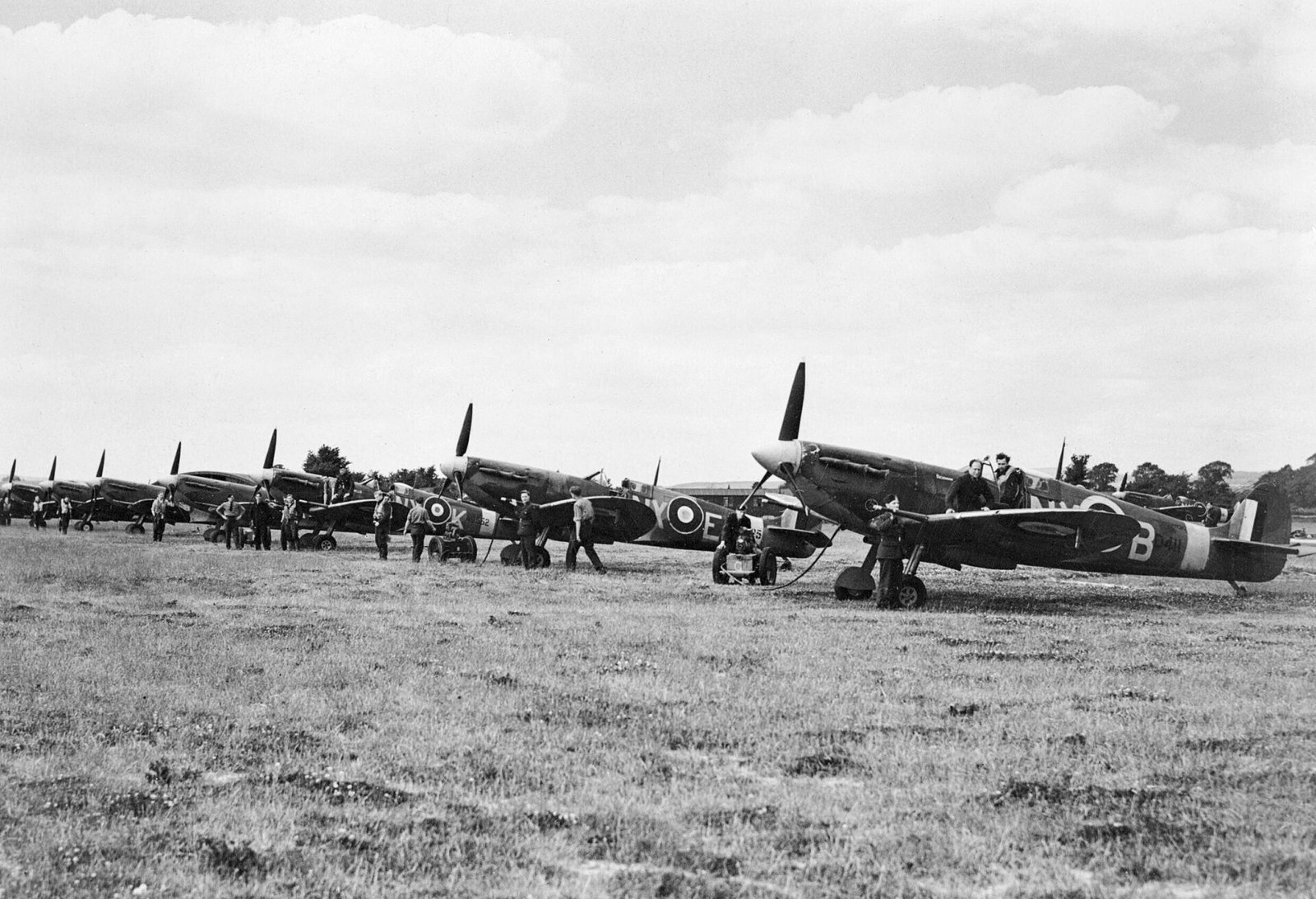
Black and white aviation photography works best when a picture is built on shape, tone and light rather than colour, and the strongest results come from shooting in raw and converting deliberately in software rather than desaturating a colour file. A silhouetted Spitfire, a smoke-trailing display team or a warbird under hard side light will often say more in monochrome than in colour, because stripping the colour forces the eye onto form, contrast and the story in the frame.
This guide is written from the flightline. It covers when monochrome is the right choice and when it is not, how to think in tones while you are still shooting, how to convert a raw file properly using the black and white mix rather than a saturation slider, and how contrast, dodging, burning, grain and toning turn a flat grey frame into a photograph with weight. It also looks at the subjects that suit mono best, a little of the history that shaped the aesthetic, and a repeatable workflow you can run on a whole airshow take. Every technique here is one you can apply to files you already have.
What this guide covers
- Why aviation suits black and white
- When black and white works, and when it does not
- Shooting for monochrome: settings and seeing in tone
- Converting a raw file: the black and white mix
- Contrast, the tone curve, dodging and burning
- Subjects that shine in monochrome
- Grain, film looks and emulation
- A short history of monochrome aviation imagery
- Split toning, sepia and selenium looks
- Static aircraft and detail shots in mono
- Common mistakes
- A repeatable black and white workflow
- Channel mix reference table
- Frequently asked questions
Why aviation suits black and white
Aircraft are among the most graphic subjects a photographer can point a lens at. They are built from clean curves and hard edges, they sit against plain backgrounds of sky or cloud, and they are lit by whatever the day gives you. Monochrome leans into all of that. Remove colour and a photograph has only four things left to work with: shape, tone, contrast and texture. An aeroplane supplies all four in abundance, which is why so much of the imagery that defined aviation, from 1940s reconnaissance prints to the classic air-to-air work of the film era, was made in black and white in the first place.
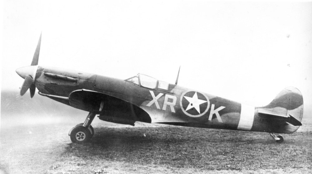
There is also a practical reason. Aviation photography often hands you light and colour that are hard to love. Hazy blue-grey skies, flat overcast, mixed floodlight at a night show, or a subject lit from behind so its colours never register. Colour can fight you in those conditions. Black and white does not care that the sky is a muddy cyan or that the light has no warmth, because it converts all of it to grey and lets you decide how light or dark each part becomes. That control is the heart of the craft, and it is why a frame you might delete in colour can become a keeper in mono.
When black and white works, and when it does not
The honest starting point is that not every aviation photograph is improved by removing its colour. Monochrome is a choice with a reason behind it, not a rescue for a weak frame. A picture works in black and white when its strength lies in something other than colour: a bold shape, a strong pattern of light and shade, weather, texture, or a sense of period. It tends to fail when the colour was the point, or when the frame is a flat mid-grey mush with no real blacks or whites in it.
Ask a simple question of any frame before converting it. If I take the colour away, is there still a picture here? A Vulcan lit from the side with deep shadow in its delta, a formation trailing white smoke against dark cloud, or a warbird catching a rim of hard sun all pass that test easily. A colourful modern special-scheme jet photographed in flat light usually does not, because the paint scheme was doing most of the work and mono discards it. Bright anniversary tail art, low-viz greys that depend on subtle tonal separation, and busy static parks full of distracting kit are the frames where colour, or a careful colour edit, usually serves you better.
There is a middle ground worth knowing. Some frames are neither obviously colour nor obviously mono, and the way to decide is to try both and be ruthless. Build a black and white version, sit it next to the colour original, and keep whichever one holds your eye longer. If you cannot tell which is better, the frame is probably not strong enough for either and your time is better spent elsewhere. Deciding early also stops you shooting for one outcome and editing for another.
Signs a frame will convert well
Look for real tonal range, meaning genuine dark areas and genuine bright areas in the same picture rather than an even wash of grey. Look for directional light, because side and back light carve shape and separate the aircraft from its background. Look for clean, uncluttered backgrounds, since a plain sky or a bank of cloud gives the aeroplane room to read. And look for texture: rivet lines, exhaust staining, weathered paint, wet tarmac, or the hard grain of cloud all come alive when colour stops competing for attention.
Shooting for monochrome: settings and seeing in tone
The single most important decision is to shoot raw. A raw file keeps all the colour information even when you intend to finish in black and white, and that colour data is exactly what you use later to control how light or dark the sky, the metal and the markings become. If you shoot a JPEG with a mono picture style baked in, the camera throws that data away and you are stuck with its interpretation. Set the camera to raw, and if you want a monochrome preview on the back of the camera, use the camera’s black and white picture profile purely as a preview. The raw file underneath stays in full colour.
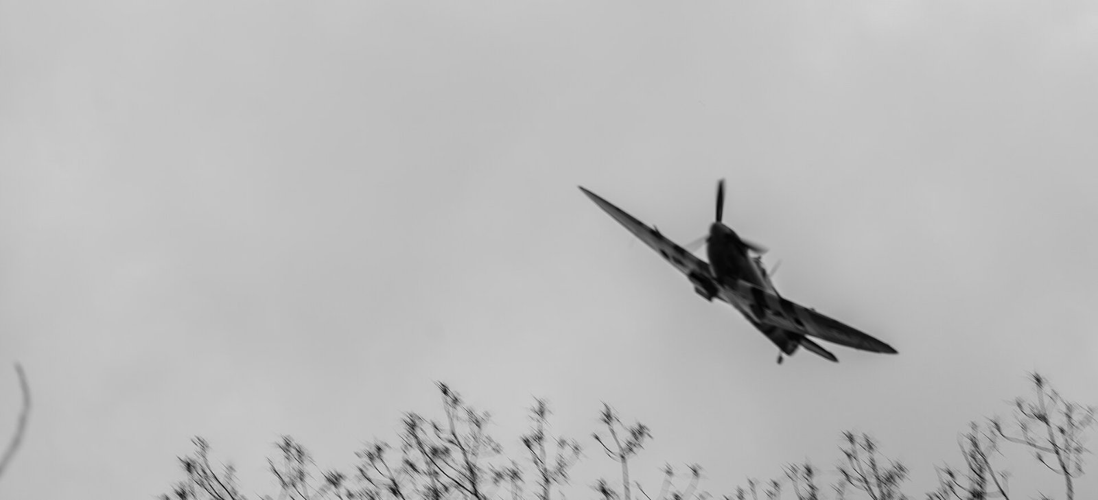
Setting the camera to a monochrome preview is not just a gimmick. Seeing the scene in grey on the rear screen, or in the electronic viewfinder of a mirrorless body, trains you to read light and shade rather than colour, and it shows you at once whether a composition has the tonal separation to work. Many photographers find they compose differently in this mode, hunting for shadow and shape instead of a pleasing colour balance. It is one of the genuine advantages a mirrorless viewfinder brings to this kind of work, because the mono preview is live in the finder before you press the shutter.
Exposure discipline matters more in mono, not less. The usual aviation rule still holds: protect your highlights. A blown-out patch of sky or a clipped wing top has no detail to recover and will read as an ugly hole in a black and white print, where the eye is drawn straight to the brightest area. Expose so the brightest important tone still holds detail, watch the histogram rather than the screen, and accept that shadows can go dark because deep, clean blacks are part of what makes a strong monochrome image. For a silhouette you deliberately expose for the bright background and let the aircraft fall to black, which is the one case where you want the subject with no detail at all.
Keep your other settings driven by the flying, not by the fact that you are shooting mono. Shutter speed still needs to freeze a jet or blur a propeller correctly, aperture still needs to hold the aircraft sharp, and ISO should stay as low as conditions allow. Do not be tempted to underexpose on purpose to get a moody look in camera, because lifting a dark raw file later adds noise. Expose properly and build the mood in the conversion, where you have far more control.
Converting a raw file: the black and white mix
The wrong way to make a black and white photograph is to pull the saturation slider to minus one hundred. It works, in the sense that it removes the colour, but it hands all the decisions to the software and usually produces a flat, lifeless grey. The right way is to tell the editor you want a monochrome image and then use the black and white mix, sometimes called the black and white panel or, in Photoshop, the channel mixer, to decide how each original colour is translated into a shade of grey.
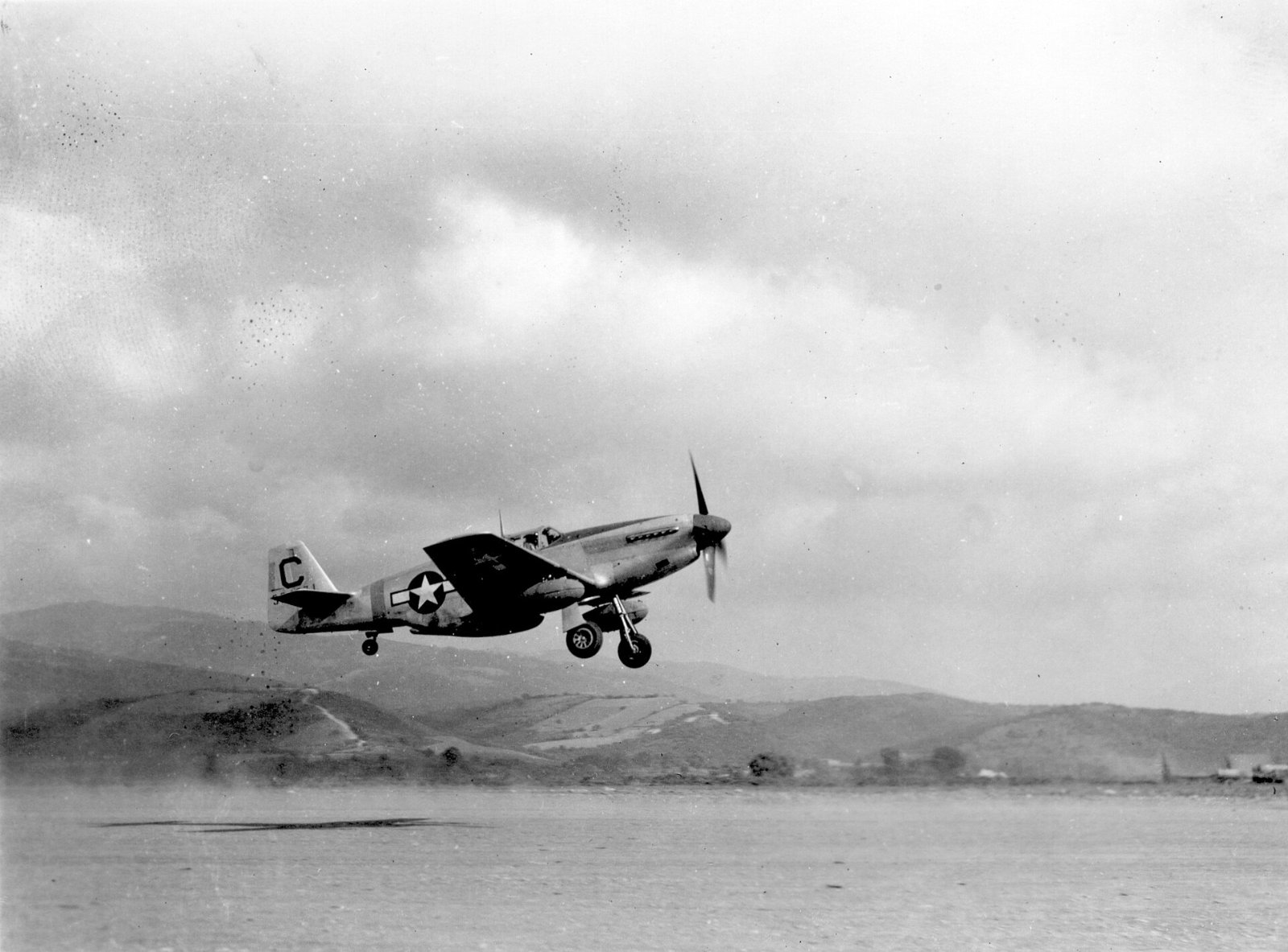
Here is why that panel is so powerful. Even though the finished image will be grey, the raw file still holds the original red, green and blue information, and the mix lets you assign a brightness to each of those colour ranges independently. If you lift the value for a colour, everything that was that colour becomes a lighter grey. If you drop it, that colour becomes darker. This is the exact digital equivalent of screwing a coloured filter onto the front of a lens in the film days, when a red or orange filter was used to darken a blue sky and make clouds leap out. You are doing the same thing after the fact, with more precision and no light loss.
For aviation the most useful move is almost always the sky. Drag the blue slider down and a pale blue sky deepens towards dramatic grey, which separates a light-coloured aircraft from its background and gives clouds real presence. Be careful not to overdo it, because pushing blue too far introduces blotchy noise in large areas of sky and can leave unnatural halos around the aircraft. Aim for a sky that is darker and moodier but still smooth. The orange and red sliders control skin tones and any warm paint or desert camouflage, while yellow and green affect grass, markings and vegetation on a static shot.
The most efficient way to work this panel is the targeted adjustment tool, the small target icon in the corner of the black and white panel in Lightroom. Click it, then click and drag directly on the part of the picture you want to change. Drag down on the sky to darken it, drag up on the aircraft to lighten it, and the software works out which colour sliders to move for you. It is faster and more intuitive than guessing which of eight sliders controls a given area, and it keeps your eyes on the picture rather than on the panel.
Once the mix is set, save it. A black and white conversion that you like is worth keeping as a preset so you can apply it to a whole shoot in one action and then fine tune each frame. It will not be perfect on every picture, because the light and the paint change from frame to frame, but it gives you a consistent starting point and saves the tedium of building every conversion from scratch. This is exactly how you keep a set of images from one airshow looking like they belong together.
Contrast, the tone curve, dodging and burning
The mix decides how colours map to grey. Contrast decides how much punch the picture has. A black and white image with no strong blacks and no clean whites looks weak no matter how careful the conversion, so the next job after the mix is to set the black point and the white point so the picture uses the full tonal range. The most controllable way to do this is the tone curve rather than a single contrast slider, because the curve lets you decide where the contrast lands.
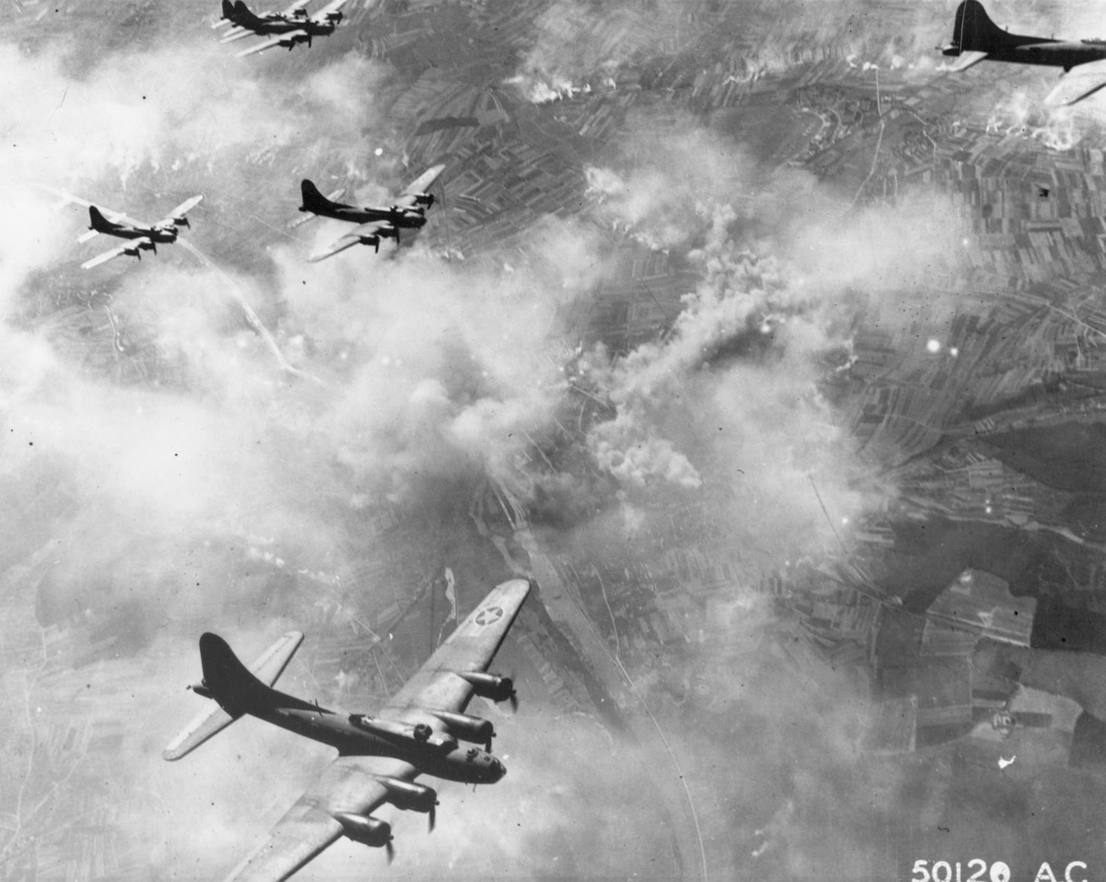
A gentle S-shaped curve is the classic move. Lift the upper part of the curve to brighten the highlights and pull the lower part down to deepen the shadows, and the picture gains contrast through the midtones where the eye is most sensitive. Steepen the S for a hard, graphic look with slabby blacks, which suits fast jets and stormy skies, or keep it shallow for a softer, more tonal result that suits older aircraft and gentler light. The key is that you are choosing where the drama sits rather than letting an automatic slider spread it evenly.
After global contrast comes local work, and this is where a black and white photograph earns its keep. Dodging is selectively brightening an area, burning is selectively darkening it, and the two together let you guide the viewer’s eye exactly where you want it. Burn down a distracting bright patch of cloud so it stops pulling attention from the aircraft. Dodge the shaded side of a fuselage a touch so the shape reads without going muddy. Darken the corners of the frame slightly, a subtle vignette, to hold the eye in the middle. These moves are small, but they are the difference between a flat conversion and a print with depth.
Clarity and texture sliders can help, but use them with restraint. A little clarity adds midtone bite to metal and panel lines, while texture sharpens fine detail like rivets and exhaust staining. Push either too hard and you get crunchy, over-processed edges and grey halos, which shout that the file has been hammered. As a rule, set your contrast and local adjustments so the picture looks strong on screen at normal viewing size, then back off the last ten percent. Monochrome punishes heavy-handed editing more visibly than colour does.
Subjects that shine in monochrome
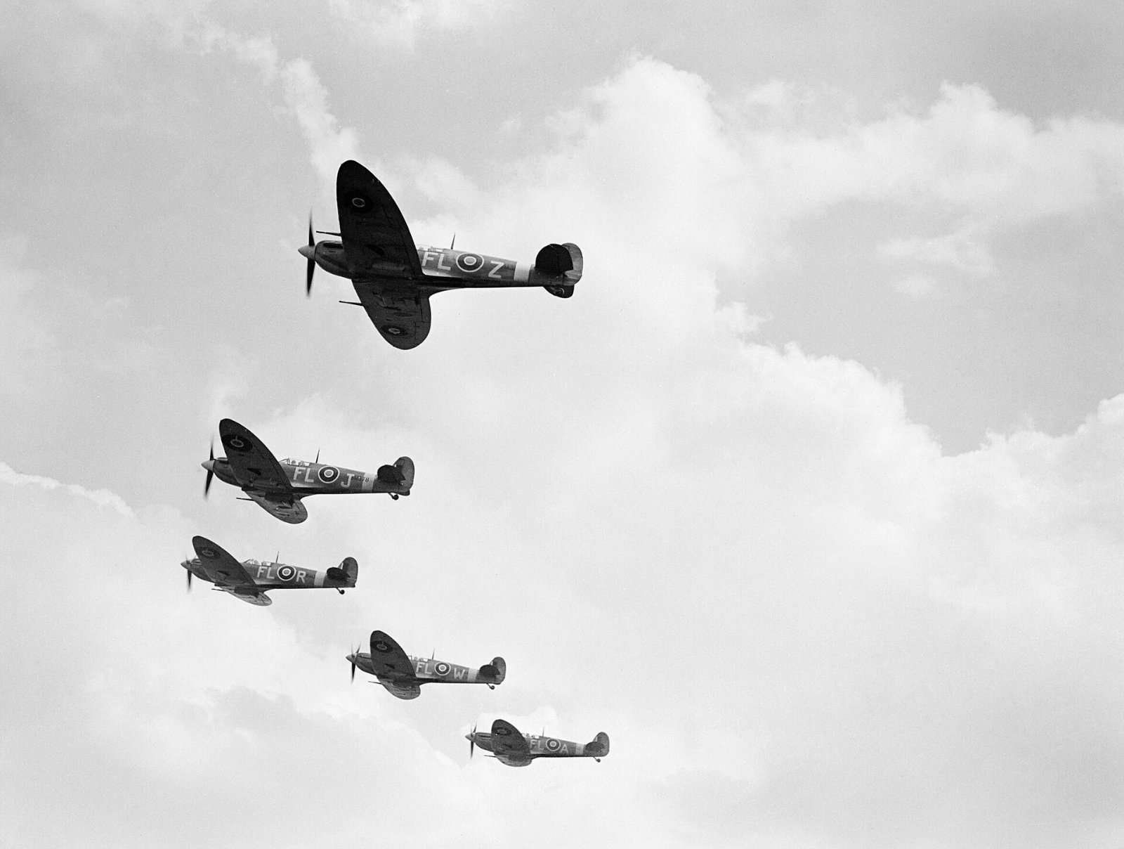
Some aviation subjects are almost made for black and white, and knowing them in advance helps you shoot with a monochrome result in mind. Warbirds are the obvious first choice, because a Spitfire, Mustang or Lancaster carries a weight of period association that colour can actually dilute. A wartime aeroplane in grainy monochrome looks like the era it came from, and the muted greens and greys of a warbird scheme convert to a rich set of tones rather than fighting each other.
Smoke and display teams are the second. It sounds counterintuitive to shoot the Red Arrows, whose whole identity is red, white and blue, in black and white, but the smoke itself is the picture. Stripped of colour, the trails become clean white lines drawing shapes across a dark sky, and the formation reads as pure geometry. The same is true of any team that lays smoke, from the Turkish Stars to a solo aerobatic display. Expose to keep the smoke bright and let the sky go dark behind it, and the pattern does the work.
Silhouettes and back-lit subjects are the third natural fit, because they are already a study in tone. An aircraft thrown into shadow against a bright sky, a jet punching through its own vapour with the sun behind it, or a helicopter dark against a glittering sea are all frames where colour was never really present. Converting them to mono simply finishes the job the light started, and it removes any muddy colour cast in the shadow that would otherwise distract.
Weather is the fourth. Storm light, heavy cloud, rain on the tarmac and low winter sun all give the strong, directional, high-contrast conditions that monochrome loves. A grey, drizzly airshow day that produces disappointing colour files can be a goldmine in black and white, because the flat colour becomes rich, textured cloud and the wet ground turns to bright reflection. Learning to see a bad-colour day as a good-mono day is one of the more useful mental shifts you can make on the flightline.
Grain, film looks and emulation
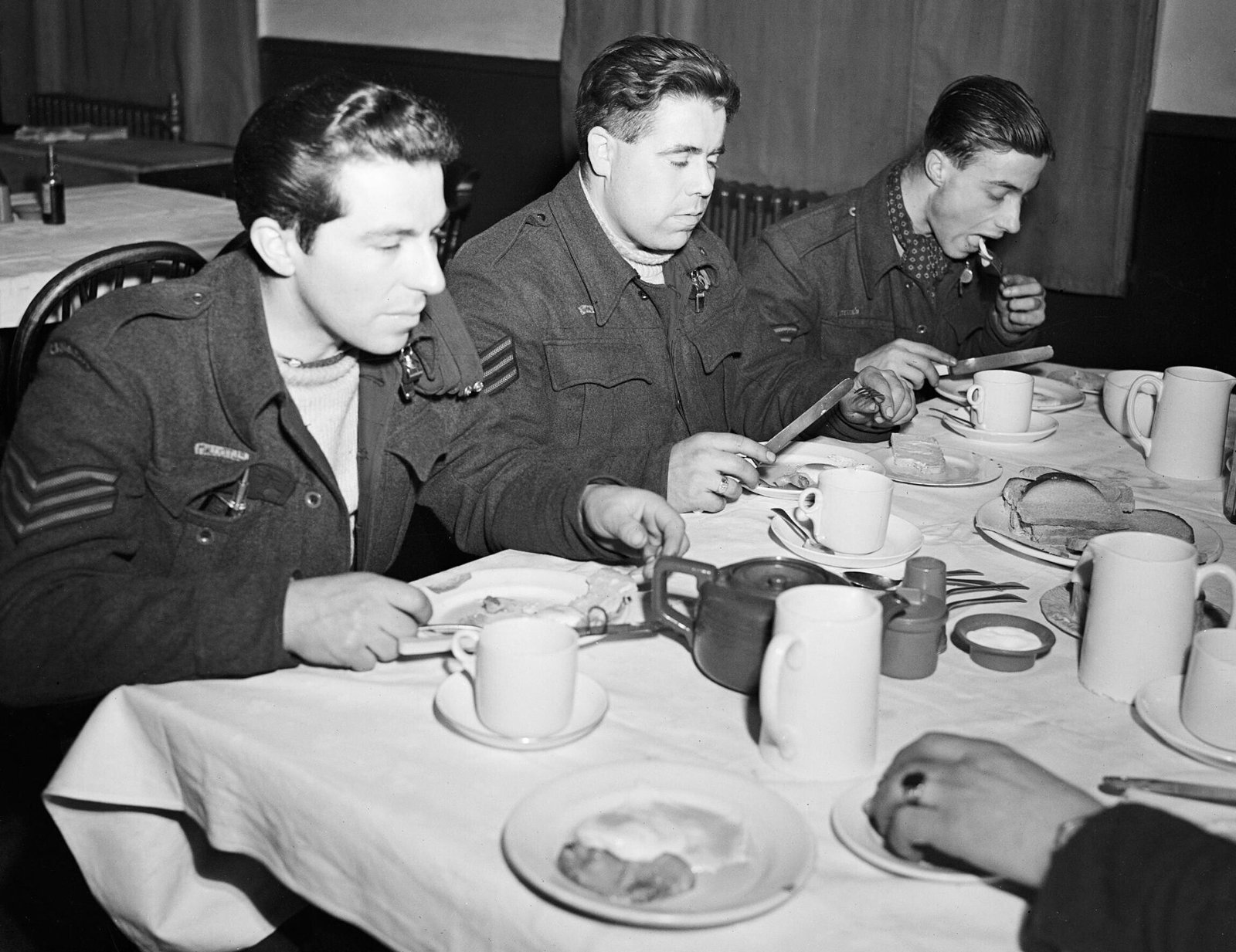
Grain is the texture that film left in an image, and adding a measured amount of it to a digital black and white file often makes the picture feel more convincing rather than less. A perfectly clean digital mono can look sterile, especially on a warbird where the eye half expects the character of film. A little grain binds the tones together, hides minor noise, and lends the print a tactile quality. Add it as the last step, after all your tonal work, and judge it at the size you intend to display the image, because grain that looks right on a small web copy can be invisible in a large print and vice versa.
If you want to go further, film emulation profiles recreate the specific tonal response and grain structure of classic stocks. The names are worth knowing because they are still shorthand for a look. Kodak Tri-X, an ISO 400 stock, gives punchy contrast and obvious grain and is the classic photojournalist film. Ilford HP5 Plus, also ISO 400, is a little softer and more forgiving. Slower films such as Ilford FP4 render finer grain and smoother tone. Emulation plug-ins and the profiles built into some raw editors let you apply these responses to a digital file, and they are a good shortcut to a coherent look, but treat them as a starting point and adjust to the specific frame rather than trusting them blindly.
Whatever route you take, keep the grain honest. The aim is a photograph that looks like it was made with intention, not one buried under an effect. If a viewer notices the grain before they notice the aeroplane, there is too much of it.
A short history of monochrome aviation imagery
Black and white is not a stylistic affectation bolted onto aviation photography. For the first half of the aeroplane’s life it was simply how photographs were made. The pioneer flights of the Wright brothers, the reconnaissance work of the First World War, the record-breaking races of the 1920s and 1930s and the entire visual record of the Second World War exist almost entirely in monochrome. When we picture a Spitfire scrambling or a Lancaster over Germany, we picture it in grey, because that is how the cameras of the day recorded it.
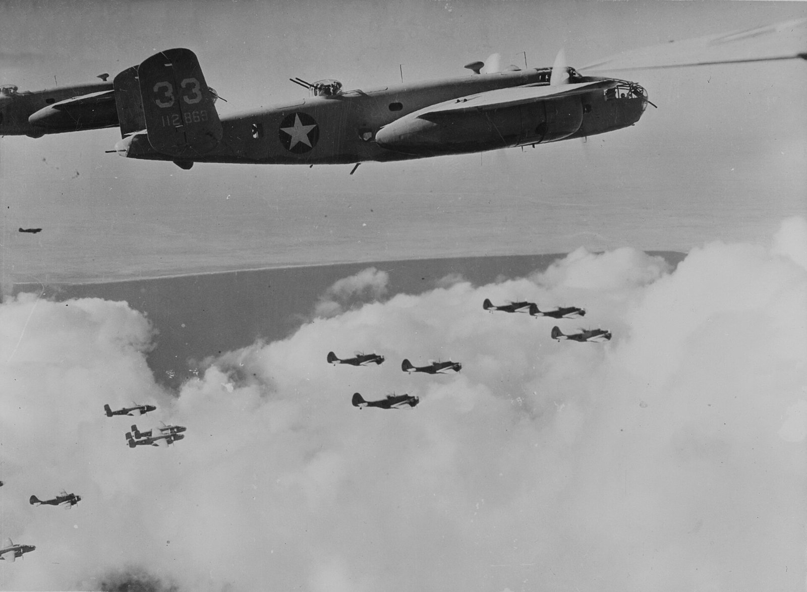
That inheritance is why monochrome carries such a strong sense of period. It is also why the aesthetic survived the arrival of colour. Long after colour film was common, aviation and military photographers kept choosing black and white for its clarity and its gravity, and the great air-to-air work of the mid-twentieth century, much of it made from open camera hatches with large-format and medium-format cameras, set a standard for composition and tone that photographers still study. When you convert a modern digital frame to mono you are stepping into that lineage, which is part of why the results feel serious in a way a snapshot does not.
Reconnaissance photography deserves a mention of its own, because it drove much of the technical development. Wartime photo-reconnaissance demanded sharp, high-contrast monochrome images that could be read for intelligence, and the discipline of exposing and printing for maximum detail fed back into general practice. The habit of thinking about tone and contrast as the primary tools, rather than colour, comes directly from that tradition, and it is still the right way to think about a black and white photograph today.
Split toning, sepia and selenium looks
A black and white image does not have to be neutral grey. Toning adds a subtle colour cast to the greys, and used with restraint it can lift a print from ordinary to distinctive. The two most useful traditional looks both come from the darkroom. Sepia, a warm brown, was originally a chemical process that also helped prints last longer, and it reads as age and warmth, which suits vintage aircraft. Selenium, a cooler tone that leans slightly towards purple-blue in the shadows, deepens the blacks and gives a crisp, archival feel that suits jets and hard light.
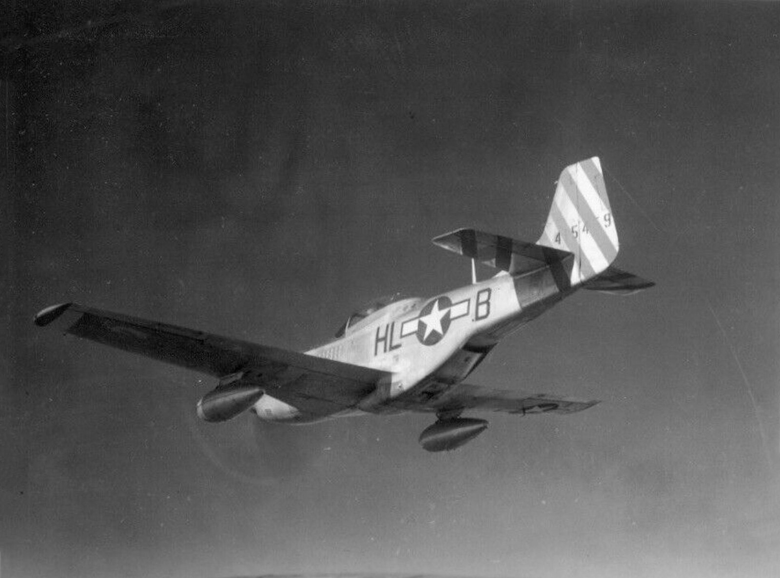
In software you create these looks with the colour grading or split toning controls, which let you add one hue to the shadows and another to the highlights. A classic split tone puts a cool tone in the shadows and a warmer tone in the highlights, which gives depth without looking obviously coloured. The trick is subtlety. Set the saturation of the tone low, so a viewer feels the warmth or coolness rather than seeing an obvious brown or blue. A heavy sepia looks like a novelty filter, while a light one looks like a considered print.
Duotones, where the whole image is built from two inks, are a print-world extension of the same idea and are worth understanding if you produce work for publication or fine-art printing. For most photographers, a gentle split tone applied in the raw editor covers the same ground and is easy to dial back if it does not suit the frame. As with grain, apply toning last and keep it quiet.
Static aircraft and detail shots in mono
Monochrome is not only for aircraft in flight. Static aircraft, cockpits and close-up details often work better in black and white than in colour, because a static park is usually a mess of competing colours, barriers and background clutter that mono quietly tidies away. Strip the colour and a parked aeroplane becomes a study of shape and surface, and the eye settles on the form instead of the busy scene around it.
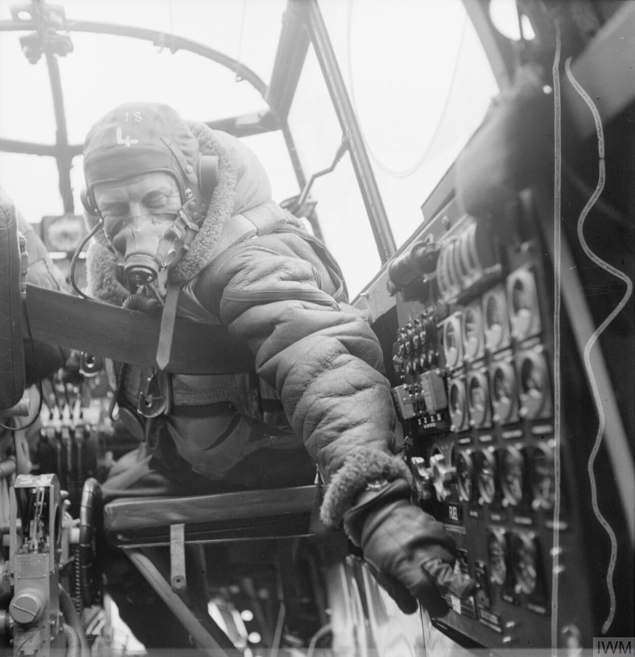
Detail and abstract shots are where mono really rewards you on the ground. The curve of a propeller blade, the rivet lines along a fuselage, the worn paint around an exhaust, the geometry of an undercarriage leg or the repeating pattern of an engine’s compressor face all become graphic images when reduced to tone and texture. Get in close, look for strong directional light that rakes across the surface to reveal texture, and treat the aeroplane as a set of shapes rather than a whole machine. These are the frames that fill out a portfolio and show you can see as well as react.
For static and detail work the usual technique advice about clean backgrounds, careful focus and considered light applies just as it does elsewhere, and it is worth reading alongside a dedicated approach to shooting parked aircraft. The monochrome conversion then does what it always does: it removes the distraction of colour and lets the form speak.
Common mistakes
The most common mistake is using black and white to rescue a frame that is simply not very good. Removing the colour does not fix weak composition, missed focus or dull light, and a mediocre photograph in mono is still a mediocre photograph. Convert frames that have a reason to be monochrome, not frames you are trying to save.
The second is the flat, grey conversion that comes from desaturating instead of using the mix and never setting a proper black point. If your picture has no true black and no clean white in it, it will always look weak. Set the tonal range first, every time. The third is overcooking the file: too much clarity, too much contrast, crushed shadows with no detail and blown highlights with no texture, and heavy grain layered on top. Monochrome shows heavy editing more plainly than colour, so aim for strength with restraint.
The fourth is neglecting the sky. A large area of flat, noisy or blotchy grey sky will sink an otherwise good frame, usually because the blue channel has been dragged down too far. Darken the sky for drama, but keep it smooth, and watch for halos around the aircraft. The fifth is inconsistency across a set: if every frame from one show has a different tone and contrast, the collection looks careless. Build a base conversion, apply it across the take, then adjust individual frames from that common starting point.
A repeatable black and white workflow
Pulling all of this together, here is a workflow that scales from a single frame to a whole airshow take. It assumes you shot raw and that you are working in a raw editor such as Lightroom, but the same steps apply in any capable software.
Start by editing the picture as if it were staying in colour: set the white balance sensibly, correct the exposure to hold the highlights, and fix the horizon and any lens distortion. A good black and white conversion begins from a well-exposed colour file, not from a rescue job. Next, switch the treatment to black and white so the editor gives you the mix rather than a desaturated version. Then use the targeted adjustment tool to set the big tonal relationships: darken the sky, lighten or darken the aircraft, and separate the subject from its background.
With the mix set, move to global contrast using the tone curve, placing an S-curve to suit the subject, harder for jets and weather, softer for warbirds and gentle light. Set a genuine black point and a genuine white point so the frame uses the full range. Now do the local work: dodge and burn to guide the eye, tame any distracting bright areas, and add a restrained vignette if it helps. Finally, add any grain and any toning as the very last steps, judged at output size, and then compare your result against the colour original one more time to be sure the mono version is really the stronger picture.
To keep a set consistent, build this conversion once on your best frame, save it as a preset, and sync it across the shoot. Then walk through the take frame by frame, adjusting the exposure and the sky on each one, because the light changed even if your recipe did not. This is how you produce a body of black and white work that looks deliberate and coherent rather than a scatter of one-off experiments.
Channel mix reference table
These are starting points, not fixed rules. Every frame is different, and the right move is always the one that serves the specific picture, but the table below gives a sensible first adjustment for common aviation situations. Values describe the direction to move each slider in the black and white mix, not exact numbers.
| Situation | Move down (darken) | Move up (lighten) | Why |
|---|---|---|---|
| Light aircraft against blue sky | Blue, aqua | Orange, yellow | Deepens the sky so a pale airframe lifts off it |
| Warbird in green or grey camouflage | Blue | Yellow, green | Holds detail in the scheme while darkening the sky |
| Smoke and display trails | Blue, purple | Leave whites high | Dark sky makes white smoke read as clean lines |
| Silhouette or back light | Everything except the light source | Yellow, orange in the sky glow | Lets the subject fall to black against a bright background |
| Desert or sand camouflage | Blue | Orange, red | Brightens warm paint and darkens the sky behind it |
| Wet tarmac and storm light | Blue | Leave highlights, add local dodging | Keeps reflections bright and cloud dramatic |
If you are new to the panel, work with the targeted adjustment tool and these directions in mind, and you will quickly learn how each subject responds. Over time you stop thinking in sliders and start thinking in tones, which is exactly the point.
Frequently asked questions
Should I shoot in black and white mode on my camera?
Shoot raw, not a baked-in monochrome JPEG. A raw file keeps all the colour information you need to control the grey tones later, so set the camera to raw and, if you like, use its black and white picture profile only as a preview. The raw file underneath stays in full colour for the conversion.
What is the best way to convert a photo to black and white?
Tell your editor you want a monochrome image and use the black and white mix, sometimes called the channel mixer, rather than pulling saturation to minus one hundred. The mix lets you decide how each original colour becomes a shade of grey, which is where the control and the quality come from. It is worth learning as part of a wider Lightroom editing workflow.
How do I darken the sky in a black and white aviation photo?
Drag the blue slider down in the black and white mix, or use the targeted adjustment tool and drag downwards directly on the sky. This deepens a pale blue sky towards dramatic grey and separates a light aircraft from its background. Do not overdo it, because pushing blue too far leaves blotchy noise and halos.
Does black and white work for colourful jets and special schemes?
Often it does not, because on a bright special scheme the colour was the point and monochrome discards it. Black and white works when a frame is built on shape, tone, light or weather rather than paint. If removing the colour leaves no picture, keep the colour version.
What camera settings should I use for black and white aviation photography?
Use the same settings you would for colour: a shutter speed that suits the aircraft, an aperture that holds it sharp, and the lowest ISO conditions allow. Expose to protect the highlights and watch the histogram. Build the mood in the conversion afterwards rather than underexposing in camera.
Should I add grain to a digital black and white photo?
A measured amount of grain often makes a digital monochrome feel more convincing and less sterile, especially on warbirds. Add it as the last step, after all your tonal work, and judge it at the size you will display the image. If a viewer notices the grain before the aeroplane, there is too much of it.
What is the difference between sepia and selenium toning?
Sepia is a warm brown tone that reads as age and warmth and suits vintage aircraft, while selenium is a cooler tone that deepens the blacks and gives a crisp, archival feel that suits jets and hard light. Both are applied with the colour grading or split toning controls. Keep the saturation low so the effect is felt rather than obvious.
Can I convert existing colour photos to black and white?
Yes, provided the file was well exposed and ideally shot in raw, and provided the frame has a reason to be monochrome. Converting will not rescue weak composition or missed focus. Try the mono and colour versions side by side and keep whichever holds your eye longer.
Which aviation subjects look best in black and white?
Warbirds, silhouettes and back-lit subjects, smoke-laying display teams and dramatic weather all suit monochrome. They share strong shape, directional light and real tonal range. You can see more of this kind of work in the Piemags galleries.
Why does my black and white photo look flat and grey?
Almost always because it was desaturated rather than converted with the mix, and because it has no true black and no clean white in it. Set a genuine black point and white point with the tone curve so the frame uses the full range. Careful sharpening and noise control then adds the final bite.
Is black and white good for static and detail shots?
Yes. A static park is usually full of competing colours and clutter that monochrome quietly tidies away, leaving shape and surface. Close-up details such as propeller blades, rivet lines and worn paint become graphic images when reduced to tone and texture, which rewards good composition.
How do I keep a set of black and white images consistent?
Build one conversion you like on your best frame, save it as a preset, and sync it across the shoot, then adjust the exposure and sky on each frame because the light changed even if the recipe did not. This gives a coherent body of work rather than a scatter of one-off looks. Images licensed this way are available through the Piemags licensing pages.
