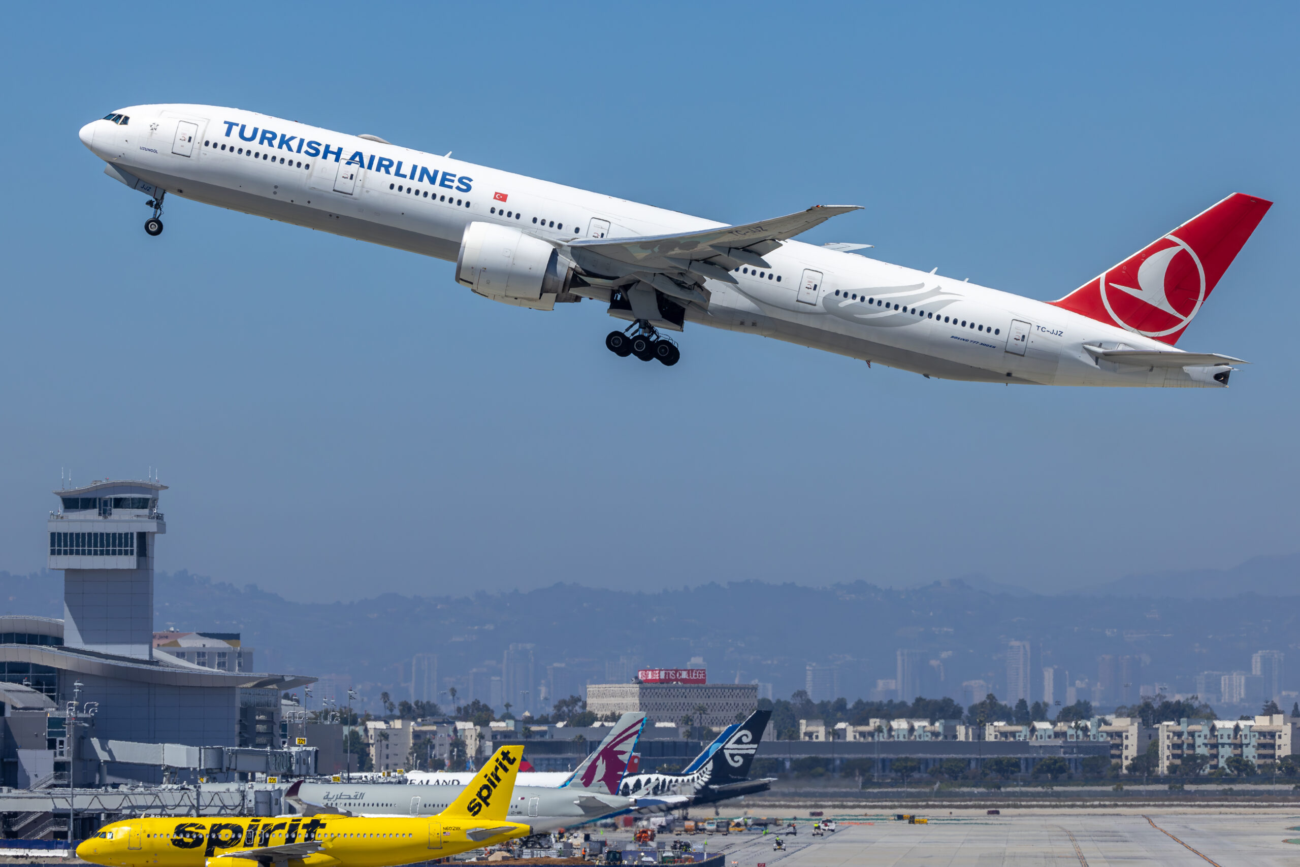
Colour grading aviation photos for a consistent look means correcting each frame to a neutral, accurate base and then applying one deliberate colour treatment across the whole set, so that a gallery, a feature or a licensed sequence reads as a single body of work rather than a bag of mismatched images. The tools are white balance, camera profiles, the HSL or colour-mixer controls and the colour grading wheels, and the discipline is to grade once and apply everywhere.
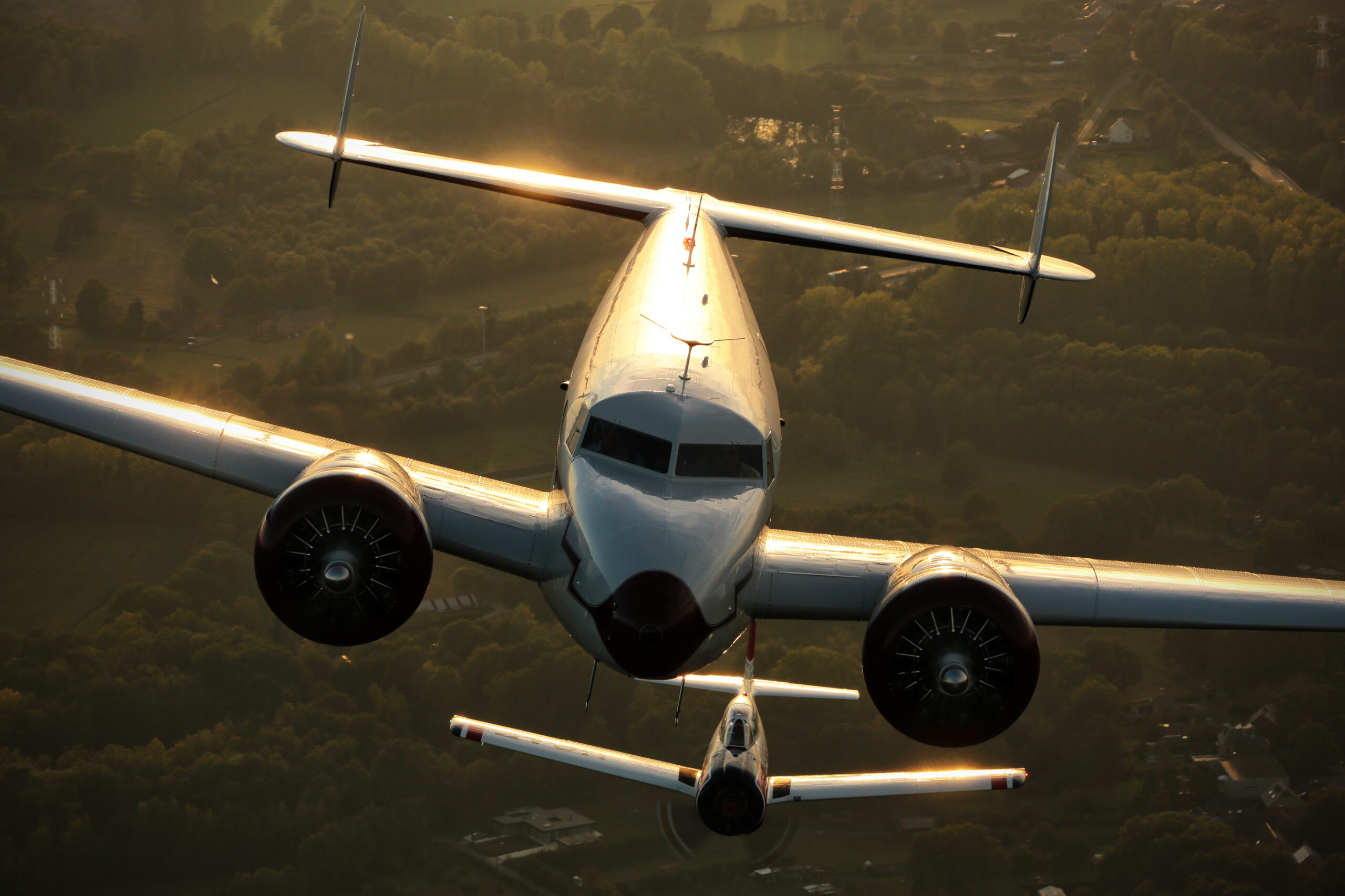
Most photographers reach a stage where individual images look good but a set does not hang together. One frame is warm, the next is cool, the greens jump around, and the collection looks restless. That is a colour problem, and it is fixable. This guide covers how to build a repeatable base, how to add a look you actually like, and how to carry that look across hundreds of frames from a single airshow or spotting session without editing each one from scratch.
It is written for aviation work specifically, because our subjects create colour problems that portrait or landscape photographers rarely meet: bare metal that mirrors the sky, saturated airline liveries that punish a careless grade, afterburners with a very specific orange, and long lens shots hazed by kilometres of atmosphere. The principles are general, but the examples are all from the flight line and the air-to-air sortie.
What this guide covers
- What colour grading is, and what it is not
- Why a consistent look matters
- Getting colour right in the camera
- Calibrate your screen first
- Set white balance before you grade
- Build a neutral base with camera profiles
- The grade: colour wheels and HSL
- Protecting liveries and key colours
- Turn your look into a preset
- Syncing a look across a whole shoot
- Grading air-to-air and formation sets
- Aviation colour problems and how to handle them
- Colour for licensing, stock and print
- A colour grading reference
- Common colour grading mistakes
- Where grading sits in your workflow
- Frequently asked questions
What colour grading is, and what it is not
It helps to separate two jobs that often get lumped together. Colour correction is technical. It removes a cast, sets a true white balance, and makes neutral things look neutral. Colour grading is creative. Once the image is correct, grading decides how it should feel: whether the light leans golden or cool, whether the shadows carry a hint of blue, whether the whole frame is punchy or restrained. Correction gets you to zero, grading takes you somewhere on purpose.
The reason the distinction matters for consistency is that you can only grade a set the same way if every frame starts from the same corrected base. If one image is left slightly warm and another slightly green before you add your look, the look sits on top of two different foundations and the results will not match. So the workflow is always correct first, grade second, and never the other way around.
Grading is also not the same as slapping a filter on top. A filter is a fixed recipe that ignores what is underneath it. A grade is a set of decisions you make in response to the image and then choose to repeat. The end result can look like a filter, clean and consistent, but it is built from controls you understand and can adjust, which is what lets you keep it looking right across very different lighting.
Why a consistent look matters
For a working aviation photographer, consistency is not vanity, it is commercial. Picture editors, agencies and print buyers look at a portfolio as a whole. A set that shares a colour signature reads as considered and professional; a set that lurches between warm and cool, saturated and flat, reads as amateur even when each individual frame is technically fine. A recognisable look is part of a photographer’s brand.
There is a practical side too. Stock and editorial buyers often license several frames from one event, and they expect them to sit together on a page. A gallery on your own site has the same requirement. If you have ever scrolled a set and felt something was off without being able to say what, it was almost always colour drifting from frame to frame. Fixing that is one of the highest-value things you can do to lift a body of work.
Consistency also compounds over time. Once you have a settled look and the presets to apply it, every new shoot slots into the same visual language, and a body of work built over years starts to feel like one photographer’s vision rather than a scrapbook. That coherence is what buyers remember and what turns a collection of good frames into a recognisable style, so the effort you put into a repeatable grade pays back on everything you shoot afterwards.
Getting colour right in the camera
Good grading starts before the computer. The single most important decision is to shoot raw. A raw file records the full colour information the sensor captured and lets you set white balance and grade colours afterwards with no penalty. A JPEG has already been white-balanced, sharpened and colour-processed by the camera, and those choices are baked in, so any strong grade you apply later fights against decisions already made.
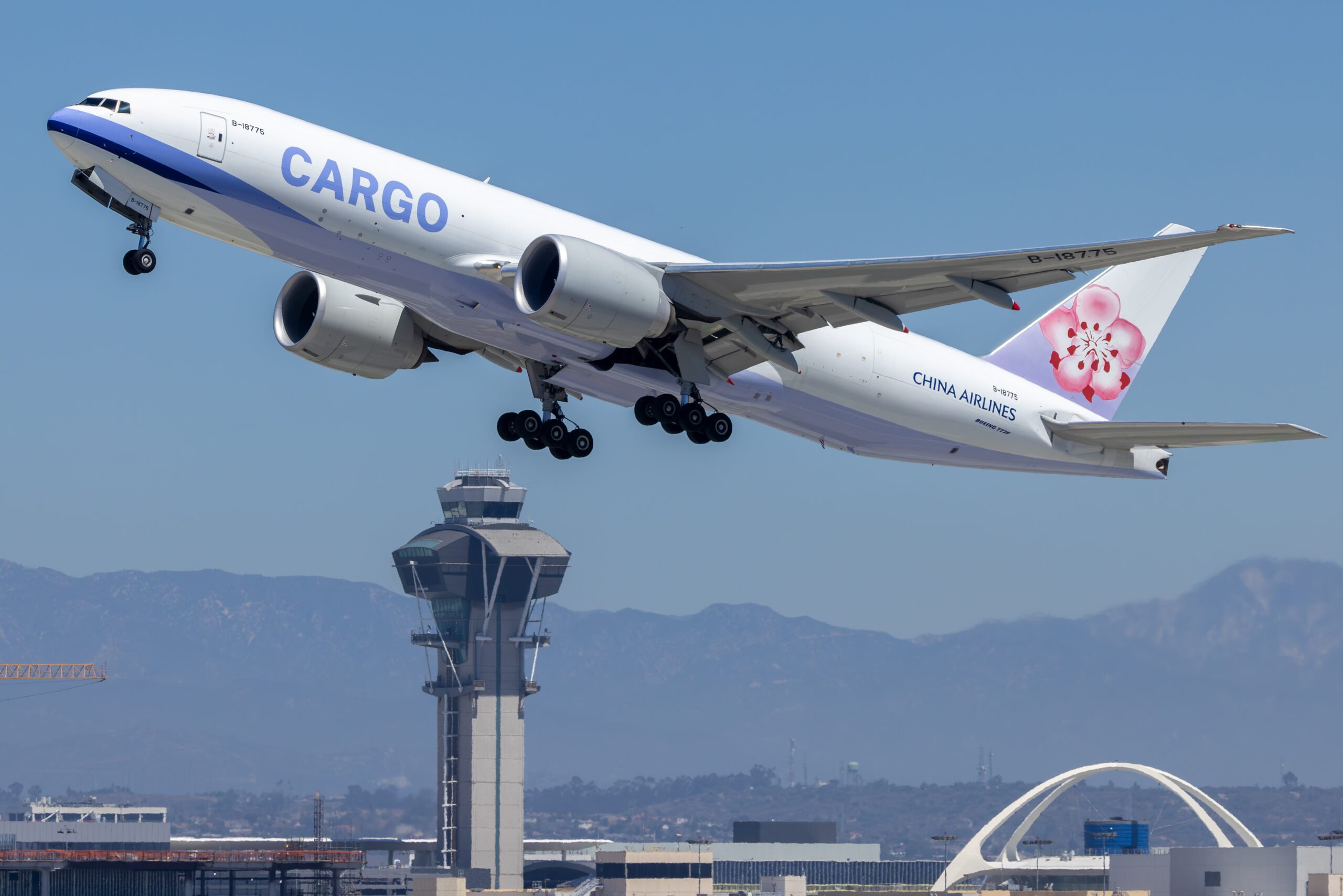
Beyond that, keep your capture habits repeatable. Use a consistent white balance setting, even on raw, so the thumbnails you cull from look coherent. Expose consistently, ideally to the right without clipping, so your midtones land in the same place. Avoid mixing picture styles or creative modes across a shoot. None of this locks you in, because raw is forgiving, but it means the set you import already looks close, and grading becomes refinement rather than rescue.
One aviation-specific point: watch your light through the day. An airshow runs from harsh noon to golden evening, and the same aircraft photographed at both ends will need different corrections to reach the same neutral base. Knowing that in advance means you are not surprised when the afternoon frames need more work to sit alongside the morning ones.
Calibrate your screen first
There is no point grading for consistency on a screen that lies to you. A monitor straight out of the box is usually too bright and often pushed towards blue, and if you edit on it you will grade against its errors, warming everything to compensate. Your images will then look wrong on every other screen and in print. A hardware calibrator measures your display and builds a profile that brings it to a known standard.
You do not need a reference-grade monitor to benefit. Even a modest IPS panel, once calibrated to a sensible brightness and a standard white point, gives you a stable, trustworthy base to grade against. The goal is not perfection, it is knowing that the colours you are deciding on are real, so that the consistency you build survives the journey from your desk to a client’s screen or a printed page.
Set white balance before you grade
White balance is the foundation of the whole process, and it is the first slider to touch on any frame. Get it right and neutral things look neutral: grey concrete, bare metal, white liveries and grey camouflage all read true. Get it wrong and every colour in the frame is skewed, so any grade you build sits on a tilted floor. On raw files you have complete freedom to set it after the fact, which is exactly why raw matters.
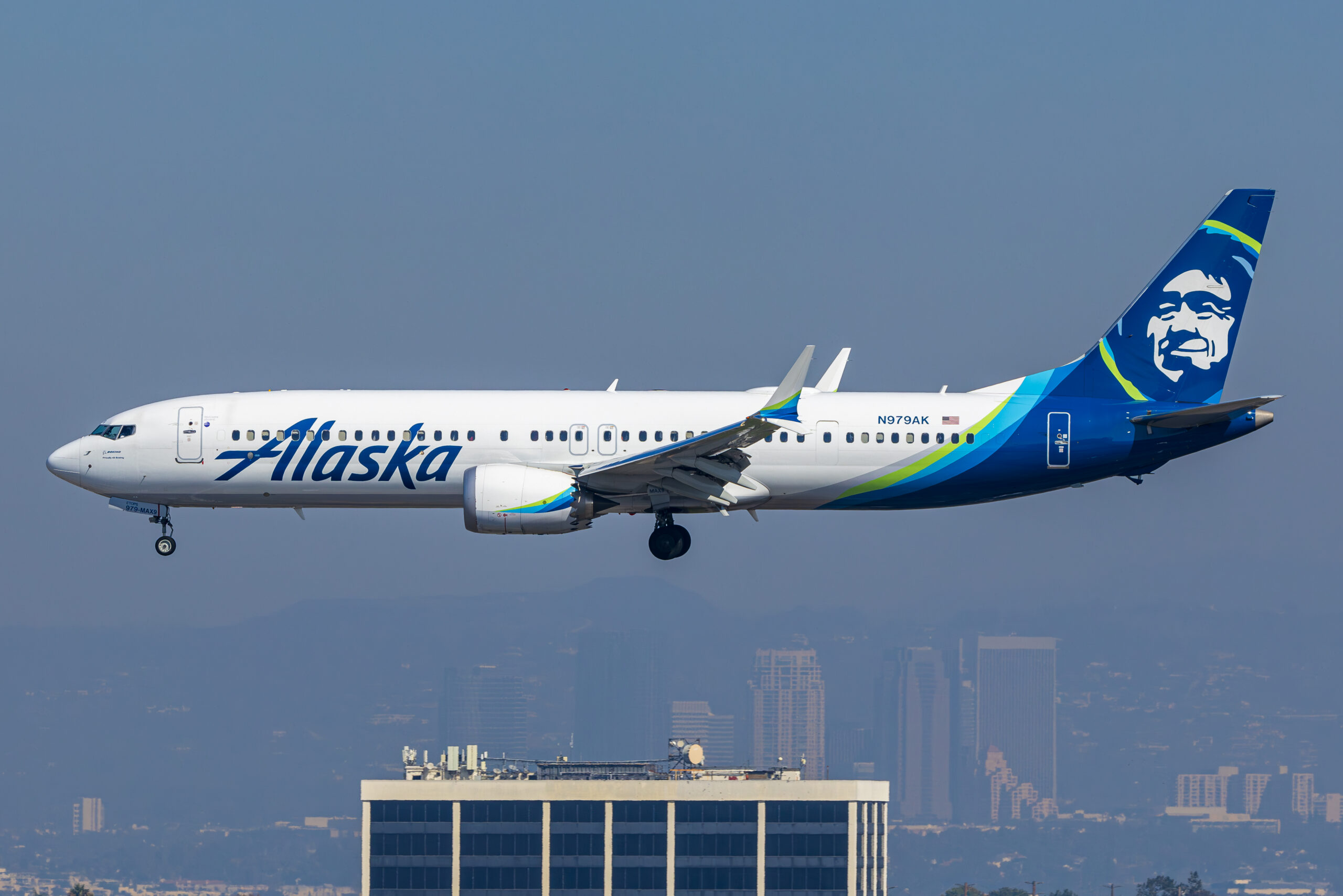
The fastest reliable method is the white balance eyedropper. Click it on something that should be neutral grey or clean white, an unpainted panel, a grey radome, a white tail, and the software neutralises the cast. Aviation gives you these references constantly, which is a gift. If there is nothing neutral in the frame, set white balance by eye against a frame from the same light that did have a reference, then match to it.
The consistency trick is to correct white balance to the same target across a sequence shot in the same light, rather than judging each frame in isolation. Photographers often nudge each image until it looks nice on its own, and the set ends up drifting. Instead, fix one frame properly, read its colour temperature and tint values, and bring the others to the same numbers before fine-tuning. That single habit removes most of the frame-to-frame wander that makes a set look untidy.
Build a neutral base with camera profiles
Before any creative grade, decide on a starting profile, because it sets the colour character every later adjustment builds on. In Lightroom and Camera Raw the Profile is chosen at the top of the develop settings, and the Adobe Color profile is a sensible, balanced default. The camera-matching profiles, which mimic your camera maker’s own colour, can be useful if you want your files to resemble the JPEGs, but the important thing is to pick one and use it consistently across the set.
The Calibration panel is the deepest and least understood colour control, and it is a quiet secret of a consistent look. It shifts the primary red, green and blue responses that everything else is built from, so a gentle move here changes the whole colour signature in a smooth, believable way. Because it acts at the foundation, a calibration tweak carried across a set is one of the most robust ways to give your work a recognisable colour fingerprint without hammering individual sliders.
The point of spending time on the base is that it does most of the work. If your profile and white balance are consistent and your calibration gives a pleasing, repeatable character, the actual grade on top can be light. Heavy grading is usually a sign that the base was wrong, and heavy grading is exactly what falls apart across varied lighting. A strong foundation lets a subtle grade carry the look.
The grade: colour wheels and HSL
With a clean base in place, the grade itself is where you add character. The main tool in Lightroom and Camera Raw is the Color Grading panel, a set of colour wheels that let you push a hue into the shadows, the midtones and the highlights separately, with a fourth global wheel for the whole image. It replaced the older Split Toning panel and does everything split toning did and more, including control over how strongly each region blends and where the tonal ranges sit.
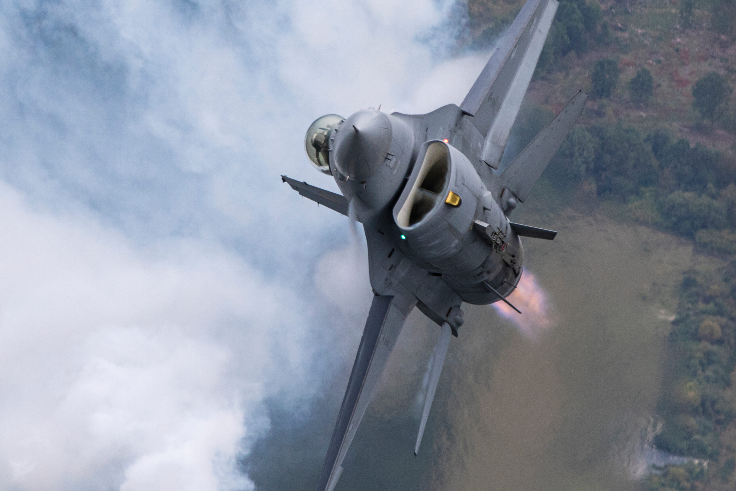
A classic, flattering aviation grade is warm highlights and slightly cool shadows. Nudge the highlight wheel towards orange or yellow to enrich sunlight on metal, and push the shadow wheel a touch towards blue to give depth without muddiness. Keep the moves small; the blend and balance controls let you dial the effect back so it reads as light and air rather than a heavy tint. Because you are working on tonal regions rather than specific objects, the same settings translate well from frame to frame.
The HSL or colour-mixer panel is the surgical partner to the wheels. Where the wheels shape the mood, HSL lets you adjust individual colours by hue, saturation and luminance: cool a cyan sky without touching a green field, calm an over-bright red, lift the luminance of a dark blue so detail shows. For consistency, decide on your HSL moves once for the dominant colours in a set, such as sky blue and grass green, and carry them across, adjusting only where a particular frame demands it.
Protecting liveries and key colours
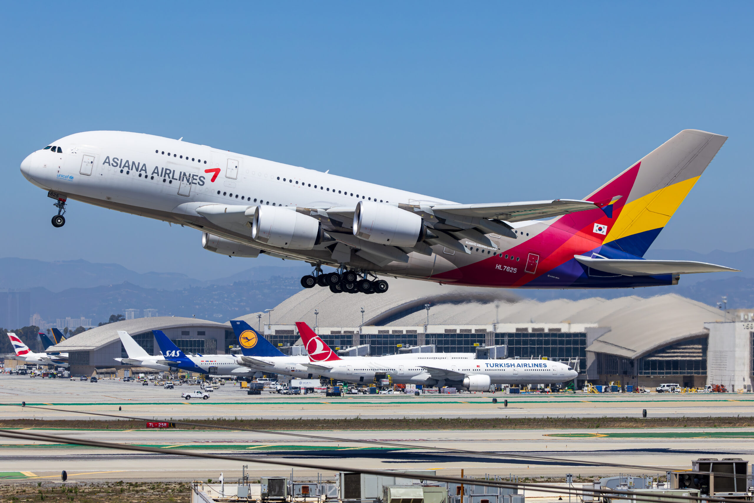
Aviation has colours you are not allowed to get wrong. An airline’s livery is a registered brand colour, an afterburner has a specific orange, national markings and roundels are exact. A global grade that looks great on the sky and the metal can quietly shift those signature colours, and a viewer who knows the airline will notice a green that has gone too yellow or a blue that has drifted teal. Protecting these colours is part of grading for a professional set.
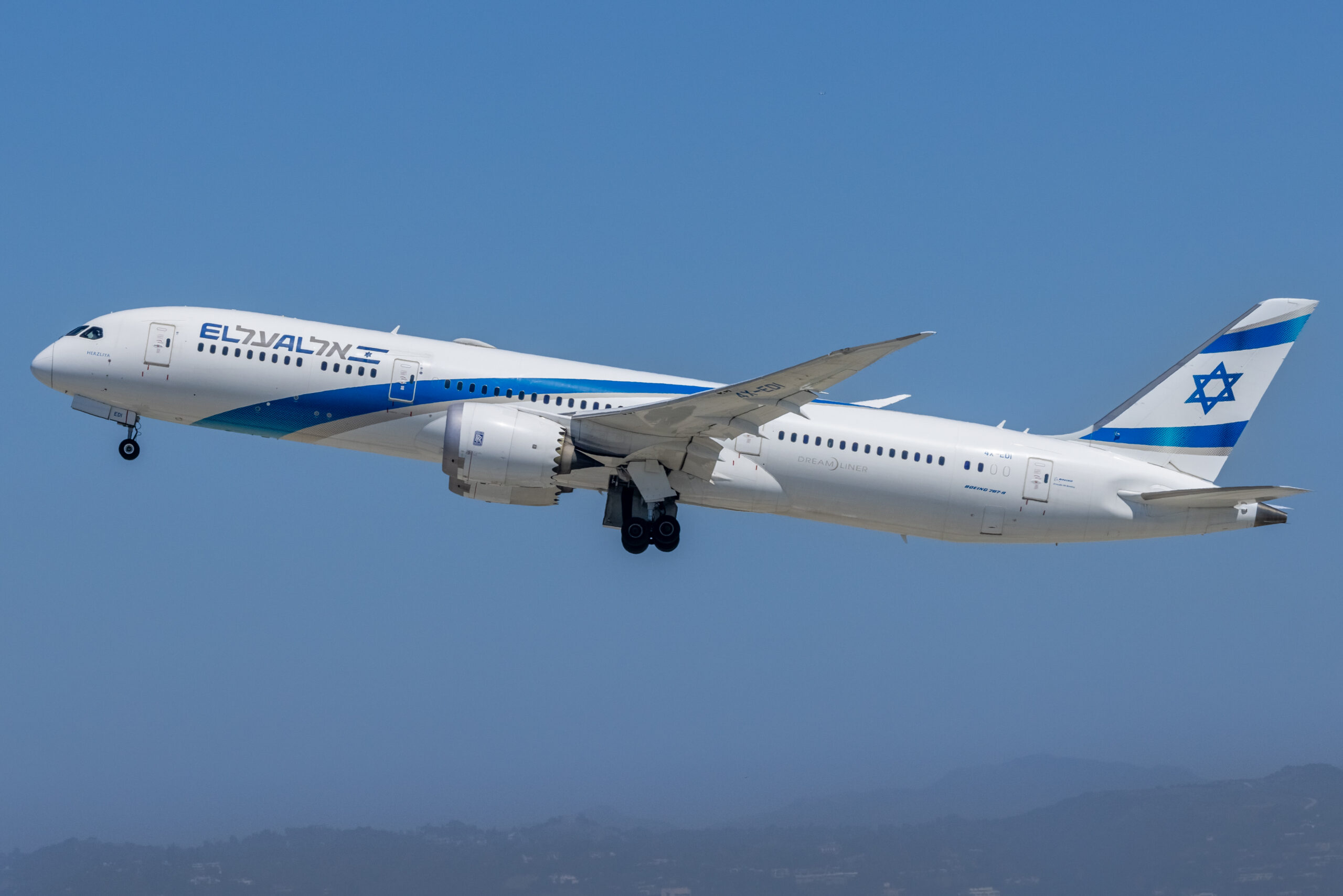
The method is to grade globally with restraint and then correct locally. After the overall look is set, check the key colours against reality and, where one has moved, pull it back with the targeted HSL controls rather than undoing the whole grade. If the grade has pushed an El Al blue towards cyan, nudge the blue hue back and settle its saturation. The global look stays, the brand colour is honoured, and the frame still matches the set.
For really precise work, local adjustment tools let you brush or mask a correction onto just the aircraft or just one panel, leaving the graded sky untouched. You will not need this often, but for a hero image destined for licensing it is worth the extra minute to make sure the livery is exactly right while the surrounding grade carries the mood.
Turn your look into a preset
Once you have a grade you like, the way to make it consistent, and to save hours, is to capture it as a preset. A preset stores your profile, calibration, colour grading and HSL choices, and often a baseline of tone and detail settings, so you can apply the whole look to a new image in one click. This is the mechanism that turns a one-off edit into a repeatable house style.
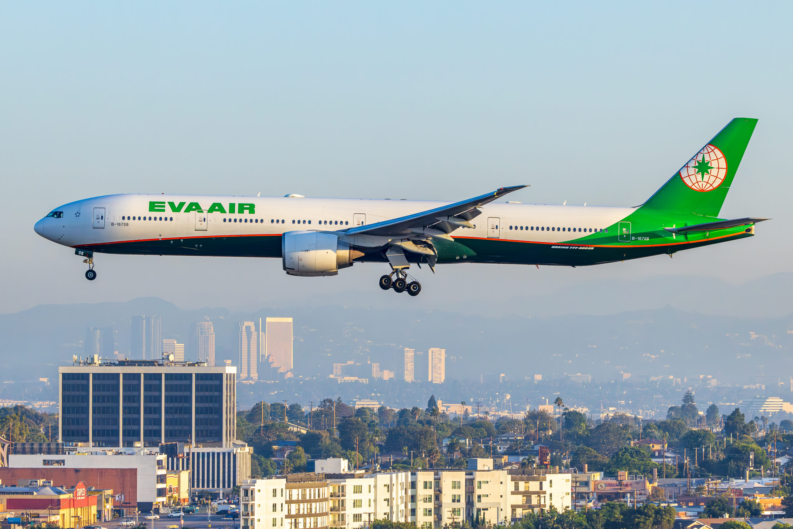
The sensible way to build one is to leave out the frame-specific settings. A good look preset carries colour, calibration and a gentle tone curve, but not white balance, exposure or spot removal, because those must be set per image. That way applying the preset gives every frame your colour signature while you still correct exposure and white balance individually. Build two or three: a bright daylight look, a golden-hour look, and perhaps a moody overcast one, all sharing a family resemblance.
Presets also travel. Once your look lives in a preset you can apply it on import, sync it across a shoot, and even use a compatible version on mobile, so the images you edit on a phone at an airshow match the ones you finish at your desk. That portability is what keeps a look consistent not just within one set but across everything you publish.
Syncing a look across a whole shoot
The real test of consistency is a full airshow take of several hundred frames. Editing each from scratch is neither realistic nor desirable, because hand-grading every image guarantees drift. The efficient, consistent approach is to grade one strong representative frame fully, then propagate its colour settings to the rest and fine-tune only what must change per image.
In Lightroom this is the Sync command. Grade your reference, select it and the frames shot in the same light, and sync the colour settings: profile, calibration, colour grading and HSL, while leaving white balance and exposure unsynced or corrected afterwards. Work through the set in blocks of similar light, one block for the harsh midday flying, another for the golden evening, each synced from a reference graded for that light. Copy and paste of develop settings does the same job frame to frame.
The mindset that makes this work is to think in sets, not single images. You are not asking whether a frame looks good alone, but whether it sits happily beside its neighbours. Judge them together, in the grid, at a glance, and the odd one out will jump straight at you. That is precisely the eye a picture editor brings, so training yourself to see it is the difference between a tidy portfolio and a restless one.
Aviation colour problems and how to handle them
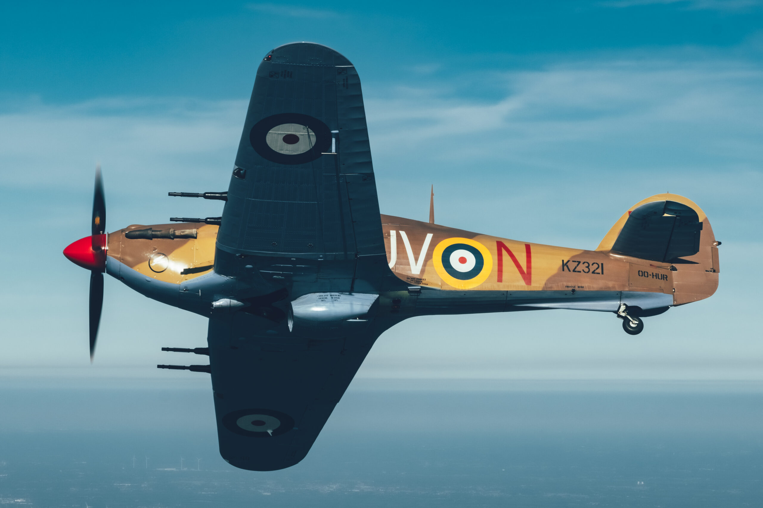
Our subject throws up colour problems that most grading advice ignores, and handling them well is a big part of a consistent aviation look. Bare metal is the first. A polished airframe is essentially a mirror, so it takes on the colour of whatever it reflects: blue from the sky above, warm from the ground below, green from a field. There is no single right white balance for it, so grade it to look believable and, more importantly, grade it the same way across the set so a natural-metal aircraft does not flip from silver-blue to silver-gold between frames.
Atmospheric haze is the second. Long lens shots across kilometres of air lose contrast and pick up a cool, milky cast, and distant aircraft can look markedly bluer than close ones shot minutes apart. If you correct each in isolation you introduce drift, so decide how much of that haze you want to keep as a sense of distance and apply the choice consistently. A small, uniform lift in contrast and a gentle warming of the far frames pulls a set together without pretending the atmosphere was not there.
Heat haze and hot exhaust add a shimmer that is really a colour and detail problem, and no grade fully fixes it, so choose frames where it is least destructive. Mixed lighting in hangars and museums is another trap: daylight through a door, warm tungsten and greenish fluorescent tubes in one frame cannot all be neutralised at once. Pick the light that falls on your subject, balance for that, and let the background go as it will. The honest answer is that some indoor frames will never sit perfectly beside daylight ones, and are best kept as a separate set.
Colour for licensing, stock and print
If your images are going out into the world, colour consistency has a technical layer beyond the grade. Colour space matters: edit in a wide space such as ProPhoto or Adobe RGB inside your raw editor, but export web and stock images as sRGB, because that is what browsers and most agencies expect. Exporting a wide-gamut file as if it were sRGB is a common cause of images that look flat or oddly desaturated once uploaded, which quietly breaks the consistency you worked to build.
For print, soft proofing lets you preview how your graded colours will render on a given paper and printer profile before you commit. Some saturated livery colours sit outside a printer’s gamut and will shift, so proofing warns you where a red or a deep blue will not reproduce and lets you adjust rather than be surprised. The aim is that a set which looks consistent on screen also looks consistent on the page.
Agencies and picture desks often have their own colour and technical requirements, and delivering to them means your grade must survive a defined output. This is another argument for a restrained, well-founded look rather than a heavy one: a subtle, accurate grade travels cleanly into sRGB and onto paper, while an extreme one is far more likely to clip, band or shift when it leaves your editor. Consistency, in the end, is as much about disciplined output as it is about the grade itself.
Grading air-to-air and formation sets
Air-to-air work is where a consistent grade earns its keep, because a single sortie produces a tight sequence that will almost always be seen together. The light changes minute by minute as the formation turns through the sun, so the same aircraft can go from front-lit and neutral to backlit and golden within a few frames. Correcting each in isolation guarantees a set that flickers. The fix is to choose the look the sortie is really about, usually the warm, rim-lit frames, and bring the others towards it rather than treating each as a separate picture.
Backlight is the defining challenge. A rim-lit warbird against a hazy sky has beautiful edge light but low contrast and a strong warm cast, and if you neutralise that cast completely you throw away the very thing that makes the frame. Grade to keep the warmth and the glow, lift the shadows just enough to hold detail in the airframe, and accept a softer, warmer palette as the identity of the set. Then carry that same treatment across the whole sortie so the cooler frames share its character.
Formation frames add a second aircraft that must read correctly too. Two airframes in different parts of the same light can take slightly different corrections, so check that both look right rather than balancing for the nearer one and letting the far one drift. When the set is graded, view it as a sequence, because that is how a magazine will lay it out, and the frame that has wandered from the family look will show itself at once.
A colour grading reference
The table below sums up the main colour controls in a typical raw editor, what each one does, and how to use it in a way that keeps a set consistent. It is written around Lightroom and Camera Raw terms, but the same controls exist under different names in Capture One, DxO and other editors.
| Control | What it does | Consistency tip |
|---|---|---|
| White balance | Sets the overall colour temperature and tint | Correct to the same neutral target across frames in the same light, not by eye per image |
| Profile | Sets the base colour character of the raw file | Choose one profile and use it for the whole set |
| Calibration | Shifts the primary red, green and blue responses | A gentle, fixed calibration is a robust way to add a colour signature |
| Color Grading wheels | Tints shadows, midtones, highlights and the whole image | Keep moves small; warm highlights and cool shadows travel well between frames |
| HSL / colour mixer | Adjusts individual hues by hue, saturation and luminance | Fix the dominant colours, sky blue and grass green, once and carry across |
| Saturation / vibrance | Global colour intensity | Use vibrance lightly; heavy saturation is the fastest way to wreck liveries |
| Presets | Store and reapply a whole look | Exclude white balance and exposure so the look travels but corrections stay per frame |
| Sync / copy-paste | Applies settings across many images | Sync colour settings from a graded reference, correct exposure and white balance after |
Common colour grading mistakes
The most common mistake is grading before correcting. If you add a look to an uncorrected frame, you are building on a cast, and the result will never match a frame that started clean. Always neutralise white balance and set your base first. The second most common is overdoing global saturation, which turns skies cyan and greens acid and destroys the very livery colours that matter most in aviation. Vibrance, used gently, is safer than saturation.
Grading on an uncalibrated or overly bright screen is a quiet killer, because you compensate for the screen and the images look wrong everywhere else. So is judging frames one at a time instead of as a set, which lets colour drift creep in unnoticed. And chasing a fashionable heavy look, deep teal shadows and crushed orange skin tones borrowed from cinema, tends to date fast and rarely suits the clean, documentary character that aviation buyers want.
Finally, beware of pushing a look so hard that it only works on one kind of light. A grade that looks stunning on a golden evening frame but turns a midday shot sickly is not a consistent look, it is a one-frame trick. Test any grade against your hardest lighting before you commit it to a preset, and keep it restrained enough to survive the whole day.
Where grading sits in your workflow
Colour grading is one stage in a larger process, and it works best in the right order. Cull first, then correct exposure and white balance, then grade for your look, then do local work and finally sharpen and export. Grading before you have culled wastes effort, and sharpening before you grade can exaggerate colour noise. Our guide to a practical Lightroom editing workflow lays out that full sequence, and colour grading slots neatly into it.
Grading also interacts with the other creative decisions you make. A golden-hour shoot already carries strong colour, so the grade should support it rather than fight it, and some frames are stronger converted to black and white, where colour grading gives way to tonal control. When you are done with colour, the final technical step is output sharpening, covered in our piece on noise reduction and sharpening.
A consistent colour signature is one of the things that makes a body of work licensable and recognisable. If you want to see how a graded, consistent set looks in practice, our aviation galleries are edited to a single house style, and the licensing page explains how consistent, buyer-ready images are made available for use.
Frequently asked questions
What is colour grading in aviation photography?
Colour grading is the deliberate shaping of the colours and tones in a finished image to create a particular look, as opposed to simply correcting a technical error. In practice it means adjusting white balance, hue, saturation and the colour of the shadows and highlights so that a set of photographs shares a consistent, intentional feel.
What is the difference between colour correction and colour grading?
Colour correction fixes what is wrong: a colour cast, a wrong white balance, a skewed tint. Colour grading is a creative choice made after correction, deciding how the image should feel, warmer or cooler, punchy or muted. You correct first so that every frame starts from a neutral base, then grade to taste.
How do I make my aviation photos look consistent?
Start from an accurate, repeatable base: shoot raw, set white balance the same way each time, and work on a calibrated screen. Then build the look once and apply it to the whole set using a preset or by syncing settings, adjusting only white balance and exposure per frame. Consistency comes from a shared starting point, not from grading each image from scratch.
Should I shoot raw or JPEG for colour grading?
Raw, wherever possible. A raw file keeps the full colour information from the sensor and lets you set white balance and grade colours after the fact with no loss of quality. A JPEG has already been graded by the camera and baked in, so heavy colour changes tend to band and fall apart.
What white balance should I use for aviation photography?
For raw files it does not matter much in camera because you can set it later, but a good habit is daylight or auto and then a precise correction in editing. The key is to make white balance consistent across a sequence, so bare metal, greys and white liveries read the same from frame to frame rather than drifting warm and cool.
Do I need to calibrate my monitor for colour grading?
If you care about accurate colour, yes. An uncalibrated screen can be too blue, too warm or too bright, so you grade to compensate and the images look wrong everywhere else. A hardware calibrator sets a known standard so what you see is close to what others will see, which is the whole point of a consistent look.
What is the Color Grading panel in Lightroom?
It is a set of colour wheels in Lightroom and Camera Raw that let you push colour into the shadows, midtones and highlights separately, plus a global wheel for the whole image. It replaced the older Split Toning panel and is the main tool for adding a graded look, such as warm highlights and cool shadows.
How do I stop editing from ruining aircraft liveries?
Grade globally with a light hand and protect specific colours locally. Watch the saturated brand colours in airline liveries and the orange of an afterburner, because a strong global shift moves them too. If a livery colour drifts, pull it back with the targeted HSL or colour-mixer controls rather than undoing the whole grade.
How do I apply the same look to a whole set of photos?
Grade one representative frame, then either save it as a preset or copy and paste, or sync, the develop settings across the rest. In Lightroom you select the graded photo and the target photos and sync the colour settings, then go through and fine-tune white balance and exposure on each. That keeps the look identical while allowing per-frame correction.
Is split toning the same as colour grading?
Split toning is a simpler ancestor of colour grading. It let you tint only the shadows and highlights, whereas the modern Color Grading panel adds a midtones wheel and a global wheel with control over how strongly each blends. Anything you could do with split toning you can do with colour grading, plus a good deal more.
Why do my blues and greens look wrong after editing?
Blues and greens are the colours most easily pushed too far, so an aggressive saturation or a strong grade can turn a sky cyan or a camouflage acid green. Back off global saturation, then use the targeted colour controls to bring individual hues back to something believable, checking against a reference such as the real livery.
Can I colour grade aviation photos on a phone?
Yes. Mobile Lightroom and similar apps include white balance, HSL and colour grading tools, and you can copy settings between images to keep a set consistent. The main limits are screen calibration and the smaller working space, so it is worth checking important edits on a calibrated monitor before licensing or printing.
